4.7 Table
The Table component acts as an organized container designed to display data in a table format, facilitating the structured presentation of information across multiple rows and columns. Its primary goal is to enhance the user experience by providing an organized and easily understandable visualization of complex datasets.
When using the Table component, users can access and analyze data efficiently, as the grid-like arrangement makes it easy to identify patterns and relationships. Additionally, the ability to customize the table's appearance through attributes such as 'headerText,' 'weights,' and 'border' provides flexibility in presentation, improving usability according to specific application requirements.
Customization options allow tailoring the table to the user's needs, whether by removing borders, assigning weights to columns, or specifying texts for header cells. This versatility makes the Table component a valuable tool for clear and effective presentation of tabular data.
| Attribute | Default Value | Type | Description | |
|---|---|---|---|---|
| Common | id | null | String | Unique identifier of the component. If it doesn't have an id, it is assigned with the nomenclature ${tag}${num}. |
| render | true | Boolean or JEXLExpression | EL expression to evaluate if the component should be displayed. | |
| onBeforeRender | null | String | JS method to execute before the current component is rendered. | |
| onAfterRender | null | String | JS method that will be executed once the current component is rendered. | |
| action | null | String | Identifier of the action to perform when the user interacts with this component. | |
| allowsPartialRestore | false | Boolean | If the state of the current component should be restored when the user returns to the view. | |
| headerText | null | String | Comma-separated list of texts for header cells. | |
| weights | null | String | The proportion of column occupancy relative to the whole. Comma-separated percentages of occupancy. If nothing is indicated, the columns will occupy the whole proportionally. | |
| border | true | Boolean | If its value is false, borders will be removed. | |
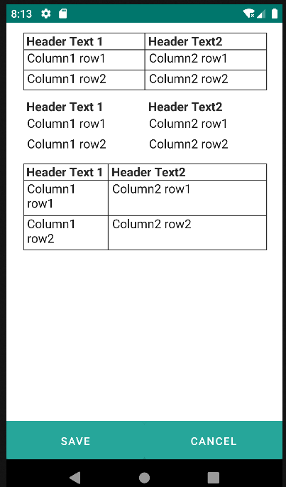
    <table headerText="Header Text 1, Header Text2">
        <row>
            <p value="Column1 row1"/>
            <p value="Column2 row1"/>
        </row>
        <row>
            <p value="Column1 row2"/>
            <p value="Column2 row2"/>
        </row>
    </table>

    <table headerText="Header Text 1, Header Text2" border="false">
        <row>
            <p value="Column1 row1"/>
            <p value="Column2 row1"/>
        </row>
        <row>
            <p value="Column1 row2"/>
            <p value="Column2 row2"/>
        </row>
    </table>

    <table headerText="Header Text 1, Header Text2" weights="35, 65">
        <row>
            <p value="Column1 row1"/>
            <p value="Column2 row1"/>
        </row>
        <row>
            <p value="Column1 row2"/>
            <p value="Column2 row2"/>
        </row>
    </table>
4.7.1 Row
| Attribute | Default Value | Type | Description | |
|---|---|---|---|---|
| Common | id | null | String | Unique identifier of the component. If it doesn't have an id, it is assigned with the nomenclature ${tag}${num}. |
| render | true | Boolean or JEXLExpression | EL expression to evaluate if the component should be displayed. | |
| onBeforeRender | null | String | JS method to execute before the current component is rendered. | |
| onAfterRender | null | String | JS method that will be executed once the current component is rendered. | |
| action | null | String | Identifier of the action to perform when the user interacts with this component. | |
| allowsPartialRestore | false | Boolean | If the state of the current component should be restored when the user returns to the view. | |
| properties | null | String | Comma-separated list of properties of the current entity to be displayed in the current row. | |
| weights | null | String | The proportion of column occupancy for this row relative to the whole. Comma-separated percentages of occupancy. If nothing is indicated, the columns in the row will occupy the whole proportionally. | |
| colspan | null | Integer | Integer determining the number of column positions each element in the current row should occupy. | |
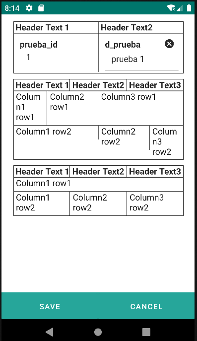
<table headerText="Header Text 1, Header Text2">
    <row properties="prueba_id, d_prueba">
    </row>
</table>

<table headerText="Header Text 1, Header Text2, Header Text3">
    <row weights="20, 30, 50">
        <p value="Column1 row1"/>
        <p value="Column2 row1"/>
        <p value="Column3 row1"/>
    </row>
    <row weights="50, 30, 20">
        <p value="Column1 row2"/>
        <p value="Column2 row2"/>
        <p value="Column3 row2"/>
    </row>
</table>

<table headerText="Header Text 1, Header Text2, Header Text3">
    <row colspan="3">
        <p value="Column1 row1"/>
    </row>
    <row>
        <p value="Column1 row2"/>
        <p value="Column2 row2"/>
        <p value="Column3 row2"/>
    </row>
</table>