4.20 Buttonbar
In the edit form and in the listing form, the configuration of the action buttons can be displayed in:
- BottomBar
- FabBar
To determine which buttons/options to show and which actions to perform, a button bar with the "type" attribute will be used with values "bottom" and "fab" if it is a button bar that needs to be displayed in the content of the view.
| Attribute | Default Value | Type | Description | |
|---|---|---|---|---|
| Common | id | null | String | Unique identifier of the component. If it doesn't have an id, it is assigned with the nomenclature ${tag}${num}. |
| render | true | Boolean or JEXLExpression | EL expression to evaluate if the component should be displayed. | |
| onBeforeRender | null | String | JS method to execute before the current component is rendered. | |
| onAfterRender | null | String | JS method that will be executed once the current component is rendered. | |
| action | null | String | Identifier of the action to perform when the user interacts with this component. | |
| allowsPartialRestore | false | Boolean | If the state of the current component should be restored when the user returns to the view. | |
| type | null | String | Type of the button bar: Fab, bottom. | |
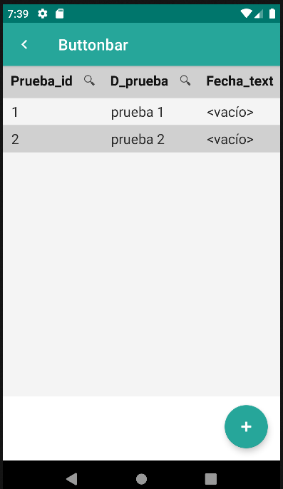
<main id="formButtonbar" name="Buttonbar" repo="pruebaRepo">
<list name="Buttonbar">
<buttonbar type="fab">
<button id="btnFab">
<action id="createPrueba" type="create" route="formButtonbar-editButtonbar1">
<param name="repo" value="pruebaRepo"/>
</action>
</button>
</buttonbar>
</list>
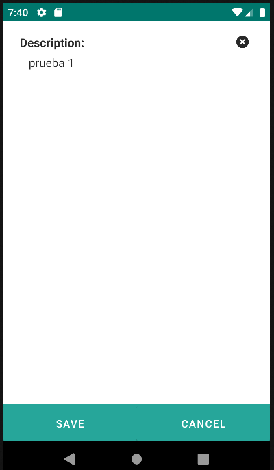
<edit id="editButtonbar1">
<form>
<input label="Description: " value="${entity.d_prueba}"/>
</form>
<buttonbar type="bottom">
<button id="btnSave" label="Save" action="save" route="back"/>
<button id="btnCancel" label="Cancel" route="back"/>
</buttonbar>
</edit>
</main>
4.20.1 Button
Ver 4.21. Button