4.6 Tab
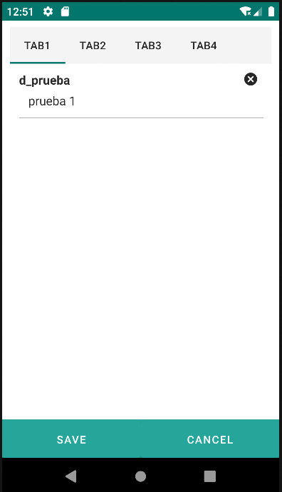
The Tab component functions as an organized container for displaying multiple tab elements, allowing users to navigate between different content sections. It enhances the user experience by presenting information in a segmented manner.
Each tab, represented by a Tabitem, can contain specific information or related functionalities. This provides an organized presentation, making it easy for users to quickly find what they are looking for. Additionally, the segmented design offers a clear view of the application structure, improving understanding and usability.
| Attribute | Default Value | Type | Description | |
|---|---|---|---|---|
| Common | id | null | String | Unique identifier of the component. If it doesn't have an id, it is assigned with the nomenclature ${tag}${num}. |
| render | true | Boolean or JEXLExpression | EL expression to evaluate if the component should be displayed. | |
| onBeforeRender | null | String | JS method to execute before the current component is rendered. | |
| onAfterRender | null | String | JS method that will be executed once the current component is rendered. | |
| action | null | String | Identifier of the action to perform when the user interacts with this component. | |
| allowsPartialRestore | false | Boolean | If the state of the current component should be restored when the user returns to the view. | |
4.6.1 Tabitem
| Attribute | Default Value | Type | Description | |
|---|---|---|---|---|
| Common | id | null | String | Unique identifier of the component. If it doesn't have an id, it is assigned with the nomenclature ${tag}${num}. |
| render | true | Boolean or JEXLExpression | EL expression to evaluate if the component should be displayed. | |
| onBeforeRender | null | String | JS method to execute before the current component is rendered. | |
| onAfterRender | null | String | JS method that will be executed once the current component is rendered. | |
| action | null | String | Identifier of the action to perform when the user interacts with this component. | |
| allowsPartialRestore | false | Boolean | If the state of the current component should be restored when the user returns to the view. | |
| label | null | String | Label to be displayed. | |
| properties | null | String | Comma-separated list of properties of the current entity to be displayed in the current tab. | |
<tab>
    <tabitem label="Tab1" properties="d_prueba">
    </tabitem>
    <tabitem label="Tab2">
    </tabitem>
    <tabitem label="Tab3">
    </tabitem>
    <tabitem label="Tab4">
    </tabitem>
</tab>