4.15 Switcher
The Switcher component offers an intuitive user interface designed to toggle between two states: on or off. Its utility lies in providing users with the ability to switch between two binary options, offering a straightforward and direct selection experience.
When using the Switcher, users can activate or deactivate a specific function or state with a simple visual switch. This component is particularly beneficial when seeking an efficient and easy way to allow users to choose between two clearly defined options.
| Attribute | Default Value | Type | Description | |
|---|---|---|---|---|
| Common | id | null | String | Unique identifier of the component. If it doesn't have an id, it is assigned with the nomenclature ${tag}${num}. |
| render | true | Boolean or JEXLExpression | EL expression to evaluate if the component should be displayed. | |
| onBeforeRender | null | String | JS method to execute before the current component is rendered. | |
| onAfterRender | null | String | JS method that will be executed once the current component is rendered. | |
| action | null | String | Identifier of the action to perform when the user interacts with this component. | |
| allowsPartialRestore | false | Boolean | If the state of the current component should be restored when the user returns to the view. | |
| Common Input Attributes | label | null | String | Label of the component. |
| validator | null | String | Type of validation for the component: required, short, long, decimal, double, float, email, iban. | |
| hint | null | String | Text serving as help or information. A button with information icon will be displayed, and when clicked, it will show a panel with the provided text. | |
| readonly | false | Boolean or JEXLExpression | Evaluate whether the component should be read-only or not. | |
| placeHolder | null | String or JEXLExpression | Value of the component when the component has no value. | |
| inputType | null | Integer | Android inputType value supported by the component. See Android InputType documentation.
For example, for PHONE_CLASS, set input_type = 3. In the case of the image, it will display the associated image toolbar:
|
|
| hasDeleteButton | true | Boolean | Indicates whether the delete button for the component will be displayed. | |
| converter | null | String | Instance of the converter to apply to the entity's property. | |
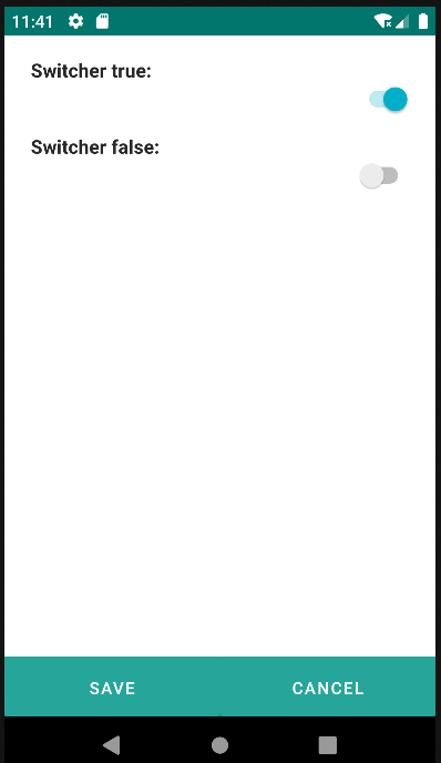
| value | false | Boolean or JEXLExpression | Component value. If true, the Switcher will be active. | |
<switcher label="Switcher true: " value="true" />
<switcher label="Switcher false: " value="false" />