4.24 Divisor
The divider component is a line used to visually separate or divide sections of content.
| Attribute | Default Value | Type | Description | |
|---|---|---|---|---|
| Common | id | null | String | Unique identifier of the component. If it doesn't have an id, it is assigned with the nomenclature ${tag}${num}. |
| render | true | Boolean or JEXLExpression | EL expression to evaluate if the component should be displayed. | |
| onBeforeRender | null | String | JS method to execute before the current component is rendered. | |
| onAfterRender | null | String | JS method that will be executed once the current component is rendered. | |
| action | null | String | Identifier of the action to perform when the user interacts with this component. | |
| allowsPartialRestore | false | Boolean | If the state of the current component should be restored when the user returns to the view. | |
| color | String | Color of the dividing line. | ||
| strokeWidth | Integer | Height (width) of the dividing line. | ||
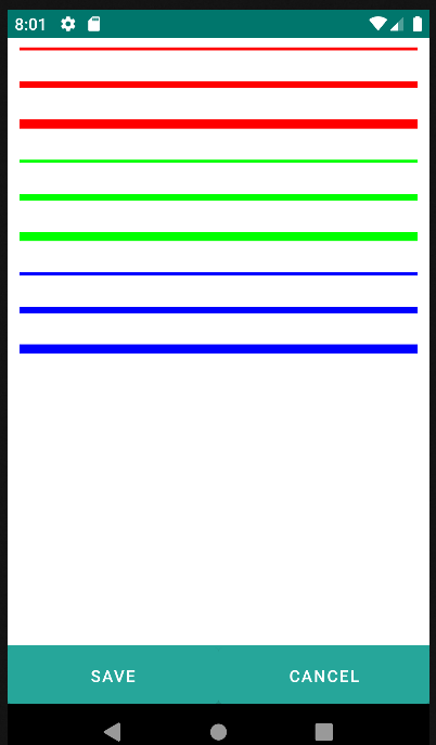
<divisor color="#FF0000" strokeWidth="8" />
<p/>
<divisor color="#FF0000" strokeWidth="16" />
<p/>
<divisor color="#FF0000" strokeWidth="24" />
<p/>

<divisor color="#00FF00" strokeWidth="8" />
<p/>
<divisor color="#00FF00" strokeWidth="16" />
<p/>
<divisor color="#00FF00" strokeWidth="24" />
<p/>

<divisor color="#0000FF" strokeWidth="8" />
<p/>
<divisor color="#0000FF" strokeWidth="16" />
<p/>
<divisor color="#0000FF" strokeWidth="24" />
<p/>