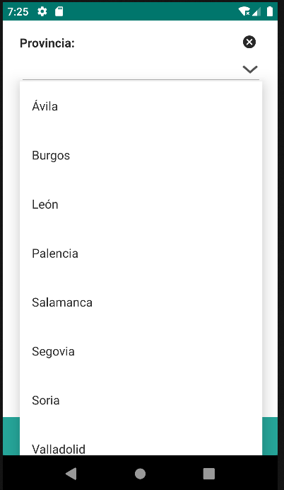
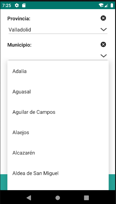
4.18 Autocomplete
An interactive component that provides real-time suggestions to the user while typing in an input field. This component facilitates the selection of options by displaying possible matches, thereby improving efficiency and accuracy in data entry.
This component is associated with a repository defined in "repo," allowing for the direct linkage of data.
Additionally, it features the ability to be filtered through the "repofilter" component, providing the capability to display specific data based on predefined filtering criteria.
| Attribute | Default Value | Type | Description | |
|---|---|---|---|---|
| Common | id | null | String | Unique identifier of the component. If it doesn't have an id, it is assigned with the nomenclature ${tag}${num}. |
| render | true | Boolean or JEXLExpression | EL expression to evaluate if the component should be displayed. | |
| onBeforeRender | null | String | JS method to execute before the current component is rendered. | |
| onAfterRender | null | String | JS method that will be executed once the current component is rendered. | |
| action | null | String | Identifier of the action to perform when the user interacts with this component. | |
| allowsPartialRestore | false | Boolean | If the state of the current component should be restored when the user returns to the view. | |
| Common Input Attributes | label | null | String | Label of the component. |
| validator | null | String | Type of validation for the component: required, short, long, decimal, double, float, email, iban. | |
| hint | null | String | Text serving as help or information. A button with information icon will be displayed, and when clicked, it will show a panel with the provided text. | |
| readonly | false | Boolean or JEXLExpression | Evaluate whether the component should be read-only or not. | |
| placeHolder | null | String or JEXLExpression | Value of the component when the component has no value. | |
| inputType | null | Integer | Android inputType value supported by the component. See Android InputType documentation.
For example, for PHONE_CLASS, set input_type = 3. In the case of the image, it will display the associated image toolbar:
|
|
| hasDeleteButton | true | Boolean | Indicates whether the delete button for the component will be displayed. | |
| converter | null | String | Instance of the converter to apply to the entity's property. | |
| value | null | String or JEXLExpression | EL expression to calculate the value of the component. | |
| repo | null | String | Identifier of the repository used to fetch the data. | |
| forceSelection | false | Boolean | If set to true, forces the user to select one of the available options, and free text input is not allowed. In this case, if the user enters any text that does not match any of the options, the component will clear the input and set null as the value of the entity property. | |
4.18.1 Options
| Attribute | Default Value | Type | Description | |
|---|---|---|---|---|
| labelExpression | null | String or JEXLExpression | EL expression used to create the label from the entity data. | |
| valueProperty | null | String | Name of the entity property used to identify the selected option, typically the entity's primary key. | |
| labelFilteringProperty | null | String | Name of the entity property used to filter the list results with user input. | |
4.18.2 Repofilter
| Attribute | Default Value | Type | Description | |
|---|---|---|---|---|
| id | null | String | Unique identifier of the component. If it doesn't have an id, it is assigned with the nomenclature ${tag}${num}. | |
The repoFilter tag has no attributes; the expression is defined by nesting predicate tags such as and, or.
- Operators: EQ, LT, GT, LE, GE, IN, NOT_IN, IS_NULL, NOT_NULL, LIKE, CONTAINS, STARTS_WITH, ENDS_WITH.
- Criteria: and, or
| Attribute | Default Value | Type | Description | |
|---|---|---|---|---|
| property | null | String | Name of the entity property used to filter the results. | |
| mandatory | false | Boolean | An operator can include the parameter "mandatory=True" to indicate that the query cannot be executed if that value is not available. | |
| value | null | String or JEXLExpression | EL expression used as the value. | |
<autocomplete forceSelection="true" id="c_provincia_id" label="Provincia: " repo="provinciaRepo" value="${entity.c_provincia_id}">
    <options labelExpression="${entity.d_provincia}" labelFilteringProperty="d_provincia" valueProperty="c_provincia_id" />
</autocomplete>
<autocomplete forceSelection="true" id="c_provmuni_id" label="Municipio: " repo="municipioRepo" value="${entity.c_provmuni_id}">
    <options labelExpression="${entity.d_nombre}" labelFilteringProperty="d_nombre" valueProperty="c_provmuni_id" />
    <repofilter>
        <eq property="c_provincia_id" value="${view.c_provincia_id}" mandatory="true"/>
        <contains property="d_nombre" value="${this.value}"/>
    </repofilter>
</autocomplete>