4.16 Date/Datetime
The Date component is used to display and input dates, while the DateTime component extends this functionality to include both date and time information.
For the "pattern" attribute, users can specify the format in which they want the date or datetime to be represented. If Unix epoch time is used (as a long field), "seconds" and "milliseconds" patterns are available. For text fields, Java date formats, such as "yyyy-MM-dd", can be applied.
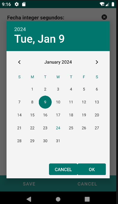
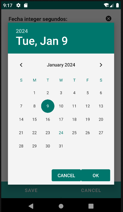
The "hasTodayButton" attribute, set to true by default, determines whether the "Today" button (for Date) or "Now" button (for DateTime) should be displayed, allowing users to easily populate the field with the current date or datetime.
| Attribute | Default Value | Type | Description | |
|---|---|---|---|---|
| Common | id | null | String | Unique identifier of the component. If it doesn't have an id, it is assigned with the nomenclature ${tag}${num}. |
| render | true | Boolean or JEXLExpression | EL expression to evaluate if the component should be displayed. | |
| onBeforeRender | null | String | JS method to execute before the current component is rendered. | |
| onAfterRender | null | String | JS method that will be executed once the current component is rendered. | |
| action | null | String | Identifier of the action to perform when the user interacts with this component. | |
| allowsPartialRestore | false | Boolean | If the state of the current component should be restored when the user returns to the view. | |
| Common Input Attributes | label | null | String | Label of the component. |
| validator | null | String | Type of validation for the component: required, short, long, decimal, double, float, email, iban. | |
| hint | null | String | Text serving as help or information. A button with information icon will be displayed, and when clicked, it will show a panel with the provided text. | |
| readonly | false | Boolean or JEXLExpression | Evaluate whether the component should be read-only or not. | |
| placeHolder | null | String or JEXLExpression | Value of the component when the component has no value. | |
| inputType | null | Integer | Android inputType value supported by the component. See Android InputType documentation.
For example, for PHONE_CLASS, set input_type = 3. In the case of the image, it will display the associated image toolbar:
|
|
| hasDeleteButton | true | Boolean | Indicates whether the delete button for the component will be displayed. | |
| converter | null | String | Instance of the converter to apply to the entity's property. | |
| value | null | String or JEXLExpression | EL expression to calculate the value of the component. | |
| pattern | null | String | Pattern with which to represent the date or datetime.
|
|
| hasTodayButton | true | Boolean | Indicates whether the "Today" button (for Date) or "Now" button (for DateTime) should be displayed. | |
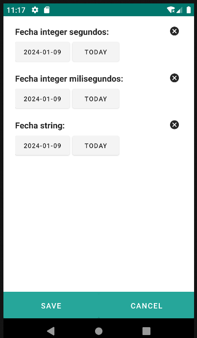
<date converter="integer" label="Fecha integer segundos: "
pattern="unixepoch_s" value="${entity.fecha_integer_seconds}" />
<date converter="integer" label="Fecha integer milisegundos: "
pattern="unixepoch_m" value="${entity.fecha_integer_milliseconds}" />
<date converter="string" label="Fecha string: "
pattern="yyyy/MM/dd" value="${entity.fecha_text}" />
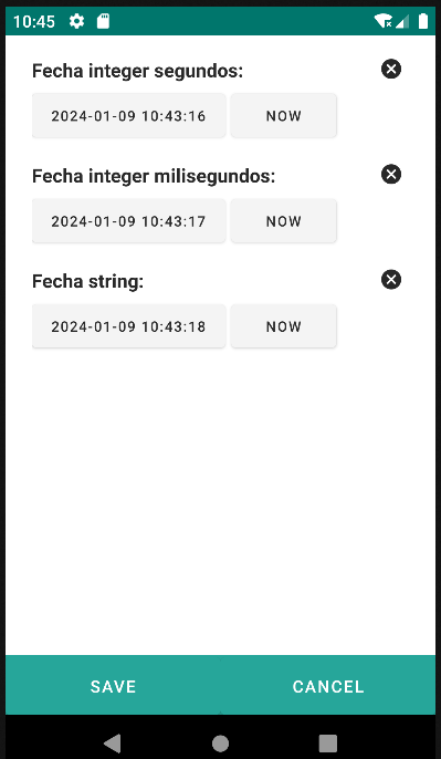
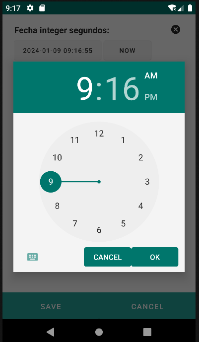
<datetime converter="integer" label="Fecha integer segundos: "
pattern="unixepoch_s" value="${entity.fecha_integer_seconds}" />
<datetime converter="integer" label="Fecha integer milisegundos: "
pattern="unixepoch_m" value="${entity.fecha_integer_milliseconds}" />
<datetime converter="string" label="Fecha string: "
pattern="yyyy/MM/dd" value="${entity.fecha_text}" />