4.17 Select
The Select component provides a user interface element for choosing a single option from a predefined list. It is commonly used to represent dropdown menus, allowing users to select one option from various choices.
This component is particularly useful when the user needs to choose an exclusive option from a predefined set. When interacting with the component, a list of options is displayed, and the user can select one of them.
| Attribute | Default Value | Type | Description | |
|---|---|---|---|---|
| Common | id | null | String | Unique identifier of the component. If it doesn't have an id, it is assigned with the nomenclature ${tag}${num}. |
| render | true | Boolean or JEXLExpression | EL expression to evaluate if the component should be displayed. | |
| onBeforeRender | null | String | JS method to execute before the current component is rendered. | |
| onAfterRender | null | String | JS method that will be executed once the current component is rendered. | |
| action | null | String | Identifier of the action to perform when the user interacts with this component. | |
| allowsPartialRestore | false | Boolean | If the state of the current component should be restored when the user returns to the view. | |
| Common Input Attributes | label | null | String | Label of the component. |
| validator | null | String | Type of validation for the component: required, short, long, decimal, double, float, email, iban. | |
| hint | null | String | Text serving as help or information. A button with information icon will be displayed, and when clicked, it will show a panel with the provided text. | |
| readonly | false | Boolean or JEXLExpression | Evaluate whether the component should be read-only or not. | |
| placeHolder | null | String or JEXLExpression | Value of the component when the component has no value. | |
| inputType | null | Integer | Android inputType value supported by the component. See Android InputType documentation.
For example, for PHONE_CLASS, set input_type = 3. In the case of the image, it will display the associated image toolbar:
|
|
| hasDeleteButton | true | Boolean | Indicates whether the delete button for the component will be displayed. | |
| converter | null | String | Instance of the converter to apply to the entity's property. | |
| value | null | String or JEXLExpression | EL expression to calculate the value of the component. | |
4.17.1 Options
4.17.1.1 Option
| Attribute | Default Value | Type | Description | |
|---|---|---|---|---|
| id | null | String | Unique identifier of the component. If it doesn't have an id, it is assigned with the nomenclature ${tag}${num}. | |
| label | null | String | Label to be displayed. | |
| value | null | String or JEXLExpression | EL expression to calculate the value of the component. | |
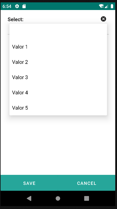
<select label="Select: " value="${entity.d_prueba}">
    <options>
        <option value="1" label="Value 1"/>
        <option value="2" label="Value 2" />
        <option value="3" label="Value 3" />
        <option value="4" label="Value 4" />
        <option value="5" label="Value 5" />
    </options>
</select>