4.14 Radio
The Radio component provides users with the ability to choose a single exclusive option from several alternatives. Its main functionality focuses on presenting a set of mutually exclusive options, where selecting one option automatically deselects the others within the same group. This behavior ensures that only one option is active within the group at any given time.
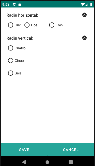
The Radio component offers flexibility in its presentation, allowing two different orientations: vertical and horizontal. You can configure the arrangement of options based on your design needs and space in the user interface.
Additionally, the "weights" attribute provides a way to distribute space among the options. By specifying percentages separated by commas, you can adjust the occupancy proportion of each option within the component. This offers detailed control over the visual presentation, allowing certain options to occupy more space than others according to your design preferences.
In summary, the Radio component not only provides the capability of exclusive selection but also offers visual customization options through orientation and weight distribution, facilitating its adaptation to different user interface designs.
| Attribute | Default Value | Type | Description | |
|---|---|---|---|---|
| Common | id | null | String | Unique identifier of the component. If it doesn't have an id, it is assigned with the nomenclature ${tag}${num}. |
| render | true | Boolean or JEXLExpression | EL expression to evaluate if the component should be displayed. | |
| onBeforeRender | null | String | JS method to execute before the current component is rendered. | |
| onAfterRender | null | String | JS method that will be executed once the current component is rendered. | |
| action | null | String | Identifier of the action to perform when the user interacts with this component. | |
| allowsPartialRestore | false | Boolean | If the state of the current component should be restored when the user returns to the view. | |
| Common Input Attributes | label | null | String | Label of the component. |
| validator | null | String | Type of validation for the component: required, short, long, decimal, double, float, email, iban. | |
| hint | null | String | Text serving as help or information. A button with information icon will be displayed, and when clicked, it will show a panel with the provided text. | |
| readonly | false | Boolean or JEXLExpression | Evaluate whether the component should be read-only or not. | |
| placeHolder | null | String or JEXLExpression | Value of the component when the component has no value. | |
| inputType | null | Integer | Android inputType value supported by the component. See Android InputType documentation.
For example, for PHONE_CLASS, set input_type = 3. In the case of the image, it will display the associated image toolbar:
|
|
| hasDeleteButton | true | Boolean | Indicates whether the delete button for the component will be displayed. | |
| converter | null | String | Instance of the converter to apply to the entity's property. | |
| value | null | String or JEXLExpression | EL expression to calculate the value of the component. | |
| weights | null | String | The proportion of space occupation for options relative to the whole. Percentages of occupation are separated by commas. If nothing is specified, options will occupy the entire space proportionally. | |
| orientation | vertical | String | Orientation of options: vertical, horizontal. | |
4.14.1 Options
4.14.1.1 Option
| Attribute | Default Value | Type | Description | |
|---|---|---|---|---|
| id | null | String | Unique identifier of the component. If it doesn't have an id, it is assigned with the nomenclature ${tag}${num}. | |
| label | null | String | Label to be displayed. | |
| value | null | String or JEXLExpression | EL expression to calculate the value of the component. | |
<radio label="Radio horizontal: " value="${entity.tipo_figura_calidad}" orientation="horizontal" weights="20, 30, 50">
    <options>
        <option id="uno" label="Uno" value="Uno" />
        <option id="dos" label="Dos" value="Dos" />
        <option id="tres" label="Tres" value="Tres" />
    </options>
</radio>
<radio label="Radio vertical: " value="${entity.tipo_figura_calidad}" orientation="vertical">
    <options>
        <option id="cuatro" label="Cuatro" value="Cuatro" />
        <option id="cinco" label="Cinco" value="Cinco" />
        <option id="seis" label="Seis" value="Seis" />
    </options>
</radio>